Press release from the issuing company:
Pantone believes that creativity has no limits—and neither should your color palette. As stark minimalism gives way to more unapologetic self-expression, designers and consumers alike are embracing emotion-driven color, bold patterns, and personality—a movement reflected in surging interest in maximalism and the rise of joyful, mood-boosting color across fashion, interiors, product, and graphic design.
As this bold era of design takes hold, Pantone recently introduced 224 new colors into the Pantone Matching System to help you stay ahead of the curve. From citrusy yellows to mystical purples, our new colors reflect today’s interpretation of maximalism and the feeling of “more” as intentional. Rather than a chaotic mix of colors, designers are carefully curating every color for the feeling and world it creates for their audience. As a result, color consistency and accuracy have never been more important to properly display that intention.
Beyond the individual colors, Pantone has also translated their trend research into four ready-made palettes that show how the new shades come together. Each is a starting point designed to direct and inspire, showcasing how this bold color trend is manifesting into distinct color stories.
Explore the four palettes derived from our new colors below that will evoke your senses and bring designs to life.
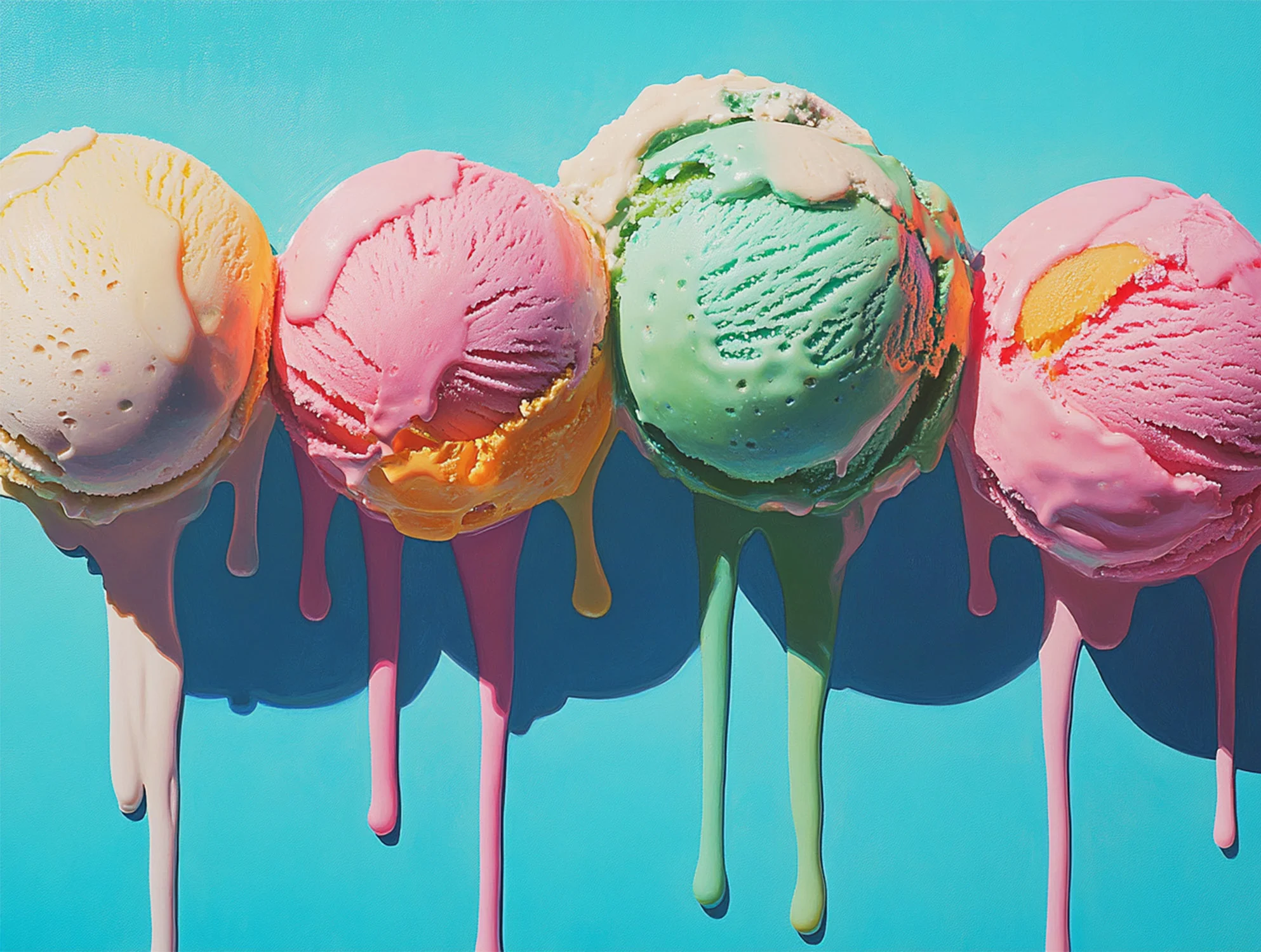
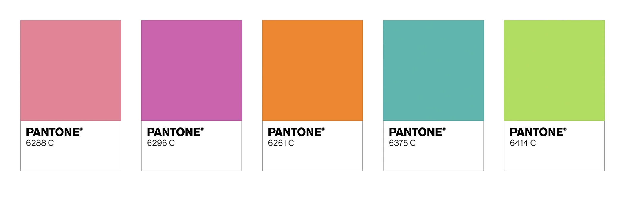
1. DESIRE FOR PLEASURE
Sickly sweet colors are a playful indulgence, evoking flavors of ripe fruit and spun sugar—like a treat you savor slowly. A pair of playful pinks are elevated by the freshness of aquatic blue and pistachio green, creating a delightful, uplifting treat for the senses, with each hue enhancing the other’s charm to create a dream-like visual experience.
 2. DESIRE FOR THE EXQUISITE
Inspired by the natural world of opulent blooms and ripened fruits, a sophisticated palette of saturated color highlights our desire for the elaborate and the elegant. An exquisite palette of chocolate and grape is energized and warmed by a nurturing peach and a pair of hot hues—a deep red and a vibrant orange—creating a contrast of light and dark.
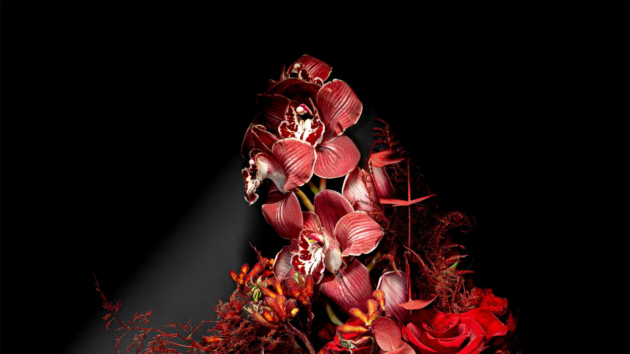
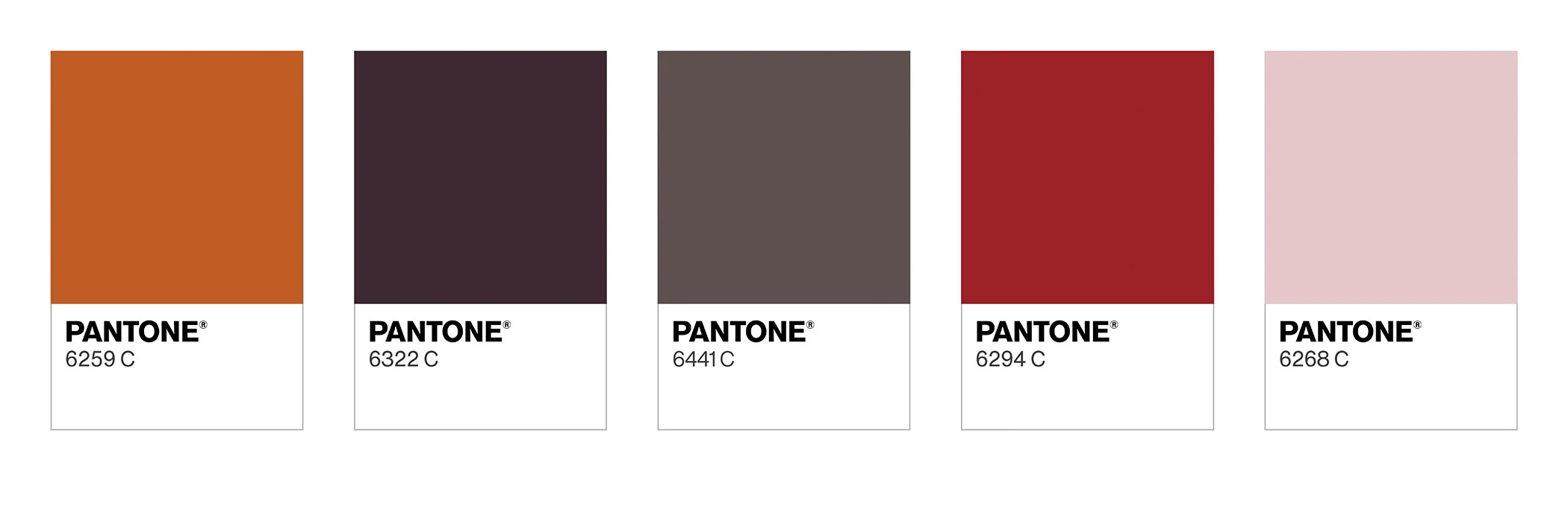
3. OXYGENATING
A vibrant palette inspired by nature’s most brilliant hues—golden amber, neon citrus green, and lush botanical greens. These colors embody energy, oxygenation, and transformation. Rooted in organic materials and living ecosystems, they enlighten and enliven, reflecting the restorative power of photosynthesis and the strength of the natural world.
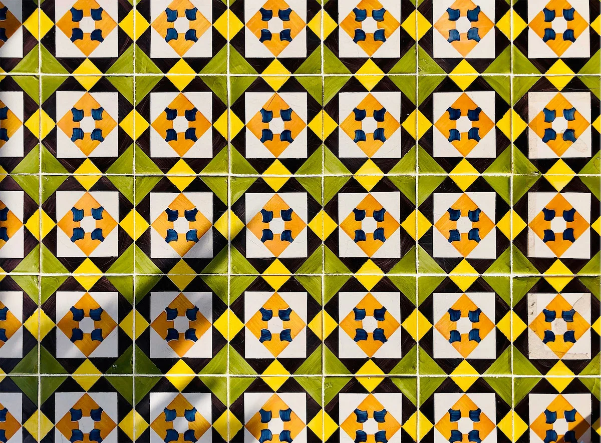
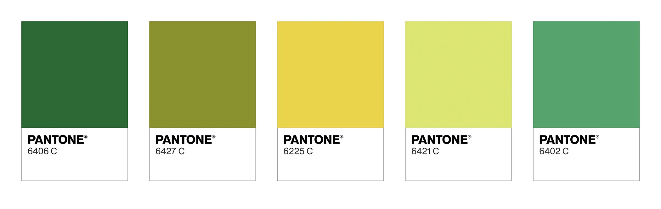
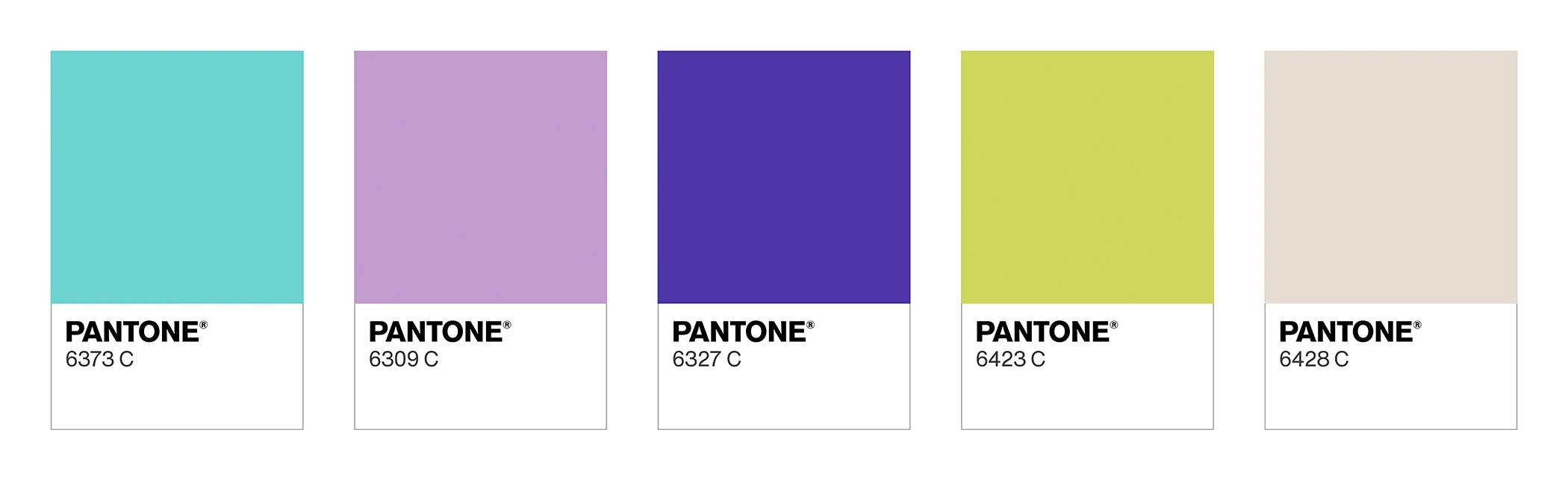
4. BEYOND BOUNDARIES
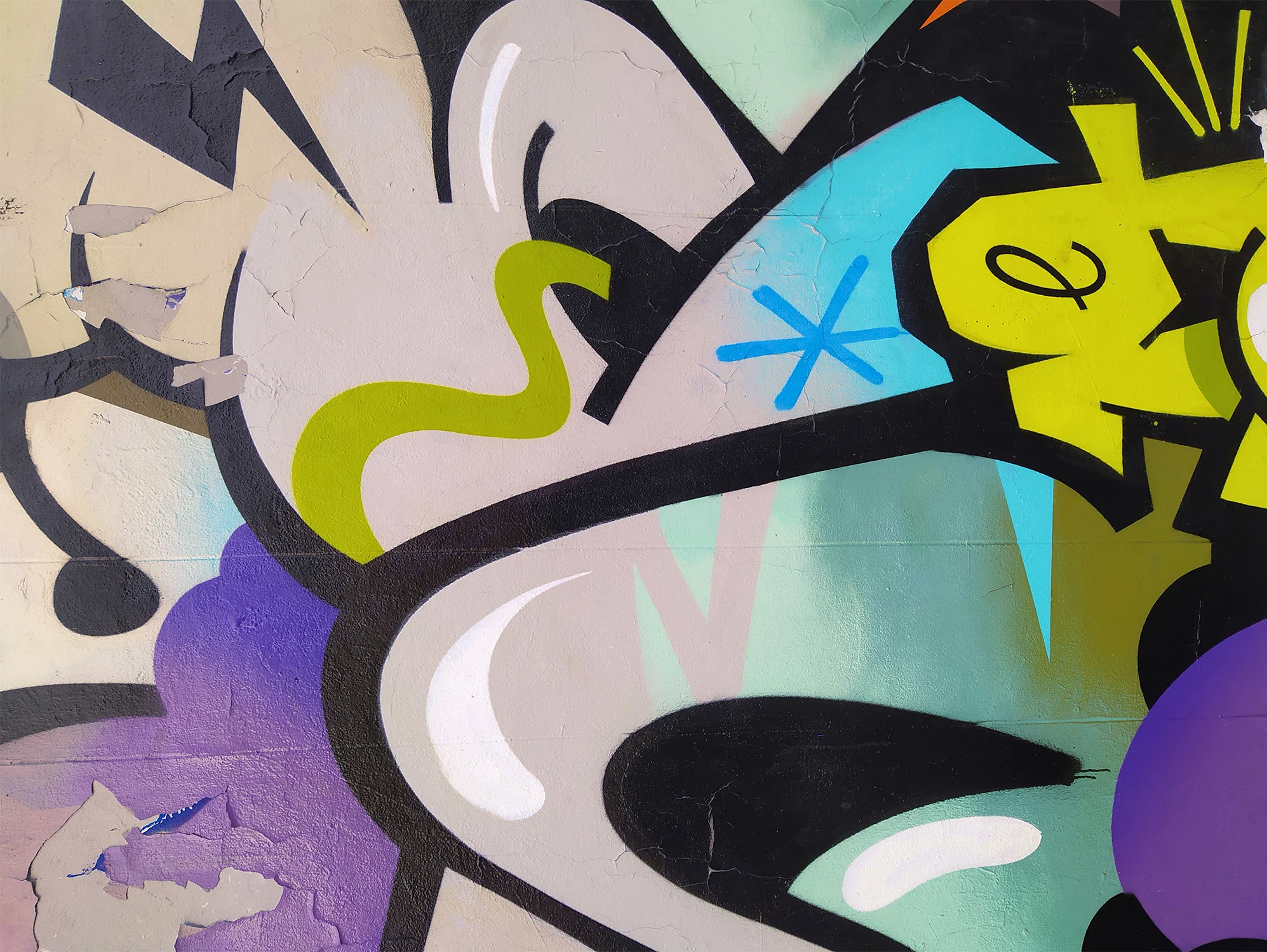
A disparate mixture of saturated brights, sherbet pastels, and calm neutrals, including a buoyant aqua, powdery lavender, magical purple, lime green, and creamy beige, reflect ideas of nostalgic play; on the other, a notion of scientific exploration. This is a family of color that has escaped the rules. Hard to place, they have a retro quality that is also very forward-looking, giving them free reign for creativity and fun.
*The 224 new colors are available now across the Formula Guide, Color Bridge, and Solid Chips Set, as well as a supplement for the Formula Guide, Color Bridge, and Solid Chips Pages for a limited time so existing customers can refresh their collections. The range is also available digitally through Pantone Connect and the Pantone Connect Extension for Adobe Creative Cloud, supporting faster exploration, sharing, and specifying directly within designers’ existing workflows.